#VCOM today - 2: My personal Top 3 Charts for fast Analysis and Decisions
When you think about your favorite charts, what is important to you? Is it only the content of the chart? What else comes to your mind - e.g. the loading time of the chart? The way data is visualized? Share your thoughts with us.
Here are the ones, that I personally like most.
Machine learning based solar power chart
No more irritation when comparing the irradiance curve to the power output. Is this gap between the two curves (power and irradiance) still okay? Or is the gap already too big? This is a question I have heard frequently, especially when meeting new partners in emerging markets or young professionals starting to work in the O&M business.
And be honest with yourself. Could you tell me, if the gap is still okay without knowing the plant?
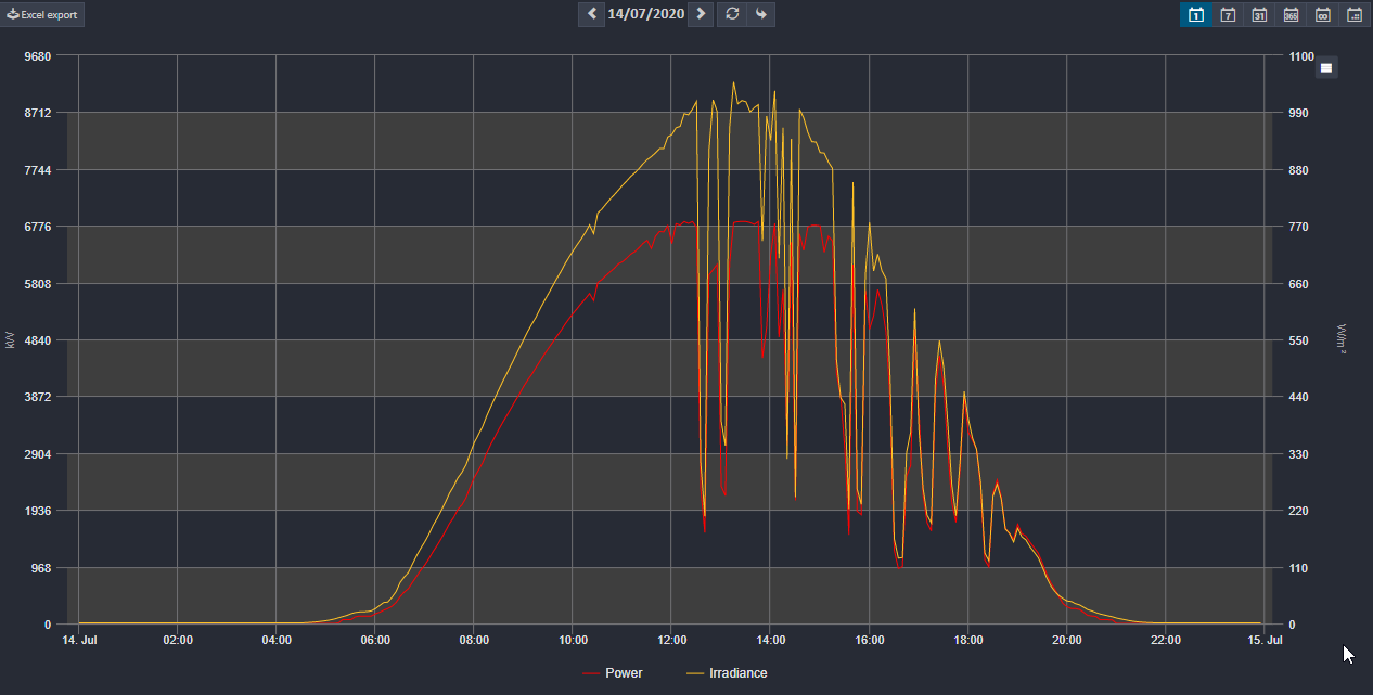
We have already learned, that it helps to keep things simple. That it makes our lives easier if the machines do the job. But how could a machine help us in the situation described earlier?Based on machine learning algorithms, meteocontrol has developed precise simulations of the target yield - live. Every 5 or 15 minutes.
Now, check the same information again in the machine learning based chart (blue line: power; light blue band: simulation range; green line: simulation; red line: losses)
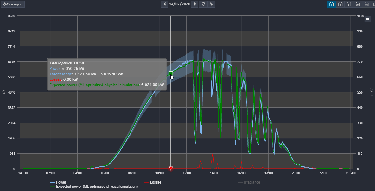
See, how precise simulations work and how easy it is to interpret the information now? There are no longer any doubts if this plant is running well or not. You don't have to ask yourself any longer, if your interpretation is right or wrong or if you are currently making mistakes with your interpretation.
You can even see, what losses you had in some of the 5 minute intervals. In this case: nothing to get nervous about.
Heat Map for Inverters and String Combiner Boxes
After checking the overall health status of the plant with the machine based simulation I often want to dive deeper. What about the inverters? Are they all running? Are some of them influenced by shading?
The Heat Map helps. It is available for inverters and even for string combiner boxes. It has never been easier to see the health of inverters at a glance.
Practice: Is everything fine with the inverters?
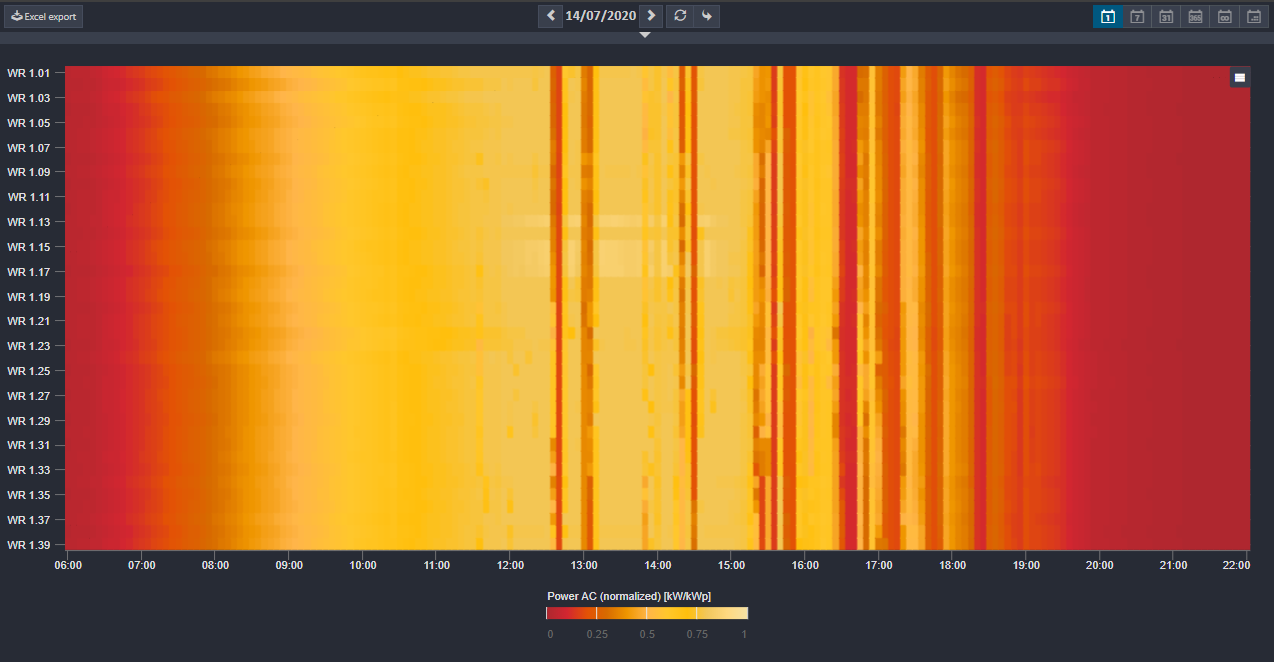
One more: Any defect?

#Nerdtalk: What could this pattern show us?

Loss breakdown
Last but not least, it is important to check if the plants are running on the best level related to the weather conditions. Commercially speaking, it is also important to see how the yield is compared to the yield forecast (cashflow!).
The loss breakdown answers both. The real monthly yield is compared to the yield forecast (e.g. from PV System) and to the monthly simulated yield taking into account the weather conditions. The last one is the most interesting one for the O&M and it gives us an answer about the overall plant performance (besides the PR calculations of course - a separate topic in one of the next articles).
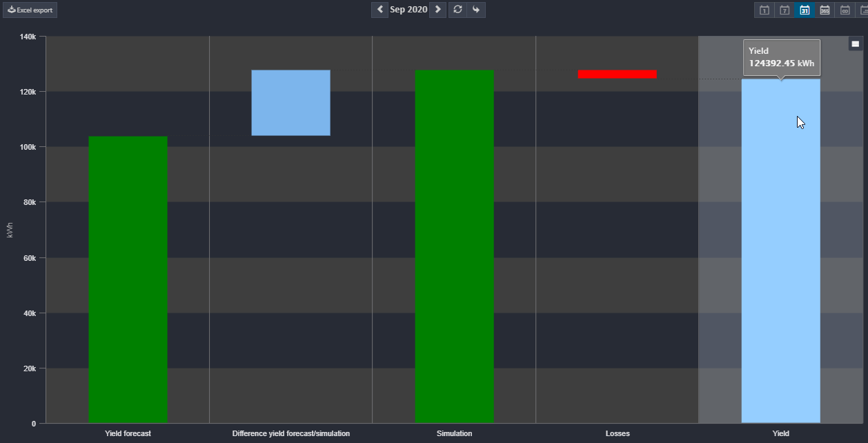
First result: Compared to the yield forecast, the weather in September 2020, Southern Germany, was pretty good. Therefore the yield was higher than expected by the static yield forecast. Second result: We can see, that the real yield and the simulation are very close to each other. The yield is a bit less. My overall conclusion by looking at this chart for 10 seconds would be: Everything's fine. Next.
Tip: Diagram Generator and Analysis Tool for creating your own charts
If the charts in the analysis section of the VCOM are not enough for you, check out the diagram generator on the plant level and the analysis tool on the portfolio level. You can use both of them to create your own charts. Save them and keep an eye on them if you see special anomalies you would like to track for a while. And delete them again as soon as you are able to draw your conclusions. It is like on your desktop - keeping the system clean helps long term ;-).
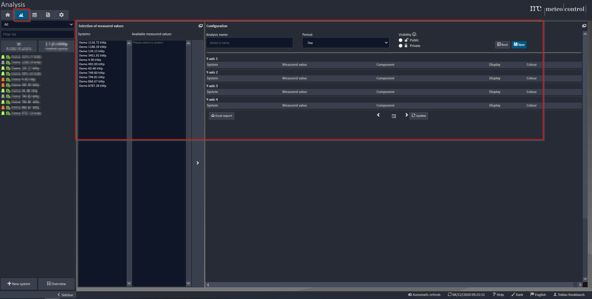
Picture: Analysis Tool on Portfolio Level
#Nerdtalk: Loading speed of the #VCOM Monitoring App
Besides the content of a chart, there are other factors that are important for loving a chart or not. One of these factors is the speed and the performance of the tool. The faster the tool is loading charts, the more I like to work with them. Would you agree that this is becoming one of the most important factors influencing us to like a tool or not? A funny anecdote I want to share with you about speed. And you can believe it or not, this story happened just one year ago. Test other tools and you will even see, that this is still PV industry standard in many cases.
Our development team was testing how a new release influences the speed of our VCOM Monitoring App - the result is amazing.
After the update the loading time of 40 plants in the VCOM Monitoring App could be reduced from almost 40 seconds to below 1 second.
If you want to see the live video, feel free to send me your Email Adress in a private message and I will gladly share the video with you. Enjoy watching and stay safe!